Angular + PrimeNG: Custom styling PrimeNG components
I hope this post can help others, considering how difficult it was for me to find a good solution. I spent a long of time on stackoverflow, github, primeNG tutorials and many other blogs and forums in the internet.
I have to say that I'm a green angular developer and using a component library such as PrimeNG is a huge help, but it can be frustrating at the same time considering the original style of the component may not match with project that you are coding.
Before we get started...
- Create a new Angular project
ng new my-project-app - Add PrimeNG to the project
npm install primeng --save - Add Font Awesome to the project (PrimeNG uses font-awesome style and icons)
npm install font-awesome --save
The Challenge
I needed to include the FileUpload component from PrimeNG in one of the pages that I'm coding, until here nothing new or hard, however the component style doesn't harmonize with the page's style.
You just don't like the component's look or the style provided by the client is totally different and the component needs to change.
So, no problem lets override the component style. Easy right? You just need to find the style name to be overridden and done. It was not that easy...
My custom component
The source code covered in this post is available here
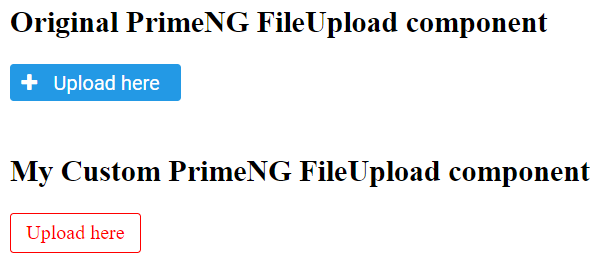
I needed to change the background and font colors, I also needed to remove the + left image from the button. So, the component will look like a link not a button.
Here is how the original PrimeNG FileUpload looks like on basic mode and how I want my final custom component.

app.component.html piece of code
<h2>Original PrimeNG FileUpload component</h2>
<p-fileUpload name="avatar" auto="true" mode="basic" accept="image/*" customUpload="true" (uploadHandler)="onFileChange($event)" chooseLabel="Upload here" ></p-fileUpload>
<br/><br/>
<h2>My Custom PrimeNG FileUpload component</h2>
<p-fileUpload id="myAvatar" auto="true" mode="basic" accept="image/*" customUpload="true" (uploadHandler)="onFileChange($event)" chooseLabel="Upload here" ></p-fileUpload>
More explanation about PrimeNG FileUpload click here
The Solution
First round FAILED
I tried to override the style as we normally do, just point the name and write my style.
CSS file
    #myAvatar span.ui-button {
        border-color:red;
        background: none;
        color: red ;
        font-family: inherit;
    }
    #myAvatar span.ui-button .ui-button-icon-left {
        display:none !important;
    }
    #myAvatar span.ui-button .ui-button-text {
        padding:.375rem .75rem !important;
    }
How the component looks after aply my css file.

As you can see in the image above it didn't work with my css.
Second round SUCCESS
After some time spent on the internet and many attempts, I finally came across the final solution Override primeng css classes in Angular
Using ::ng-deep in front of the style that you created do the magic. Allowing to enter in the component and change the style.
CSS file
    ::ng-deep #myAvatar span.ui-button {
        border-color:red;
        background: none;
        color: red ;
        font-family: inherit;
    }
    ::ng-deep #myAvatar span.ui-button .ui-button-icon-left {
        display:none !important;
    }
    ::ng-deep #myAvatar span.ui-button .ui-button-text {
        padding:.375rem .75rem !important;
    }
An then I finally got my custom component.

More explanation about shadow DOM style scoping you can find in Component Styles or How and Where to use ::ng-deep?
Now it is your turn to change the style of any component as you wish and your project requires.
Hope it helps.